It’s all well and good to read design articles and view pictures of “accent walls” or “bold paint color schemes” when you own your home, but what about situations where your color palette is restricted? Rental home and apartments come to mind, as do situations where one partner enjoys brightly colored rooms and a particular design style and the other one is less than enthusiastic about it.
Fortunately, there are a few tips and tricks you can use to decorate your home stylishly, even when your color palette is restricted. And in fact, many design aficionados – such as the late author Edith Wharton – intentionally restrict their color palettes in order to allow furnishings and fixtures to take center stage and to create home environments that are soothing and relaxing, rather than busy and cluttered.
6 Tips for Decorating with a Restricted Color Palette
Choose furniture with attractive lines and curves. If you are using a restricted palette, the features of your furniture and fixtures will stand out. For this reason, try to find furniture that is attractively shaped or has a unique visual appeal, as well as pieces that are comfortable.
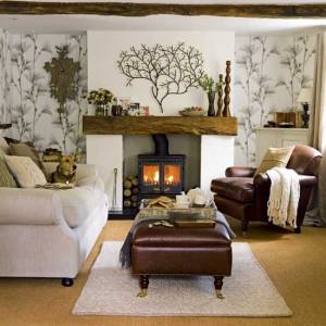
Select softly-colored accents and textiles. Typically, a muted color palette will be predominantly white, cream, or perhaps a soft beige. Either way, any amount of color or pattern will stand out significantly more than it would in a more multi-colored design scheme. For that reason, select window coverings, accent pillows or textiles that are softly colored or have a very mellow pattern, to keep with the muted motif.
Think texture rich. If you aren’t careful, a muted or restricted palette can end up being boring and very one-dimensional. That is not the idea. Every living space should have a nice balance of texture and depth to make it more interesting. Use a mix of textures and fabrics such as cotton upholstery, a woven basket or rug, and a soft, fluffy throw. Furry pets are optional, but you get the idea. Mixing fabrics with wood, metal and or stone accents makes for a more visually appealing space.
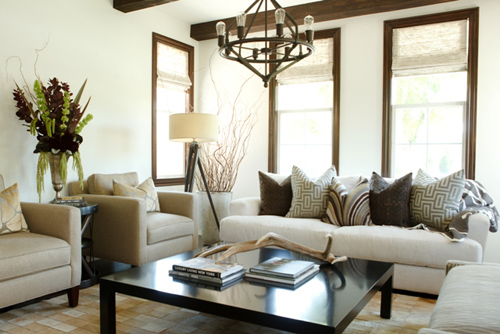
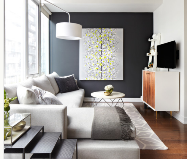
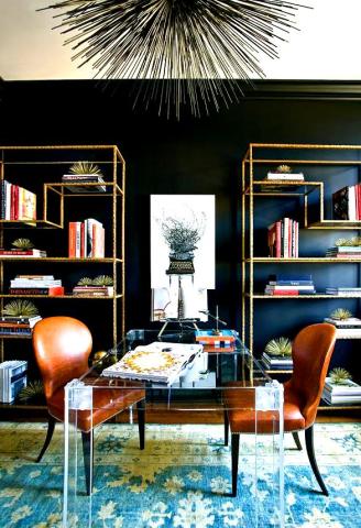
Show off your art. Art is always an appreciated addition to any interior design, but with a muted color palette, you really have the ability to show it off. Even a large-scale painting, such as this equine print, can get lost in a room decorated with a darker or more busy color scheme. The simple muted tones in the living room link above help the black lines of the horse stand out, making it the focal point for the entire living space.
Add live plants. Plants and flower arrangements really pack a more powerful punch when they are used in a room with a restricted palette. They come to life, and every green leaf or petal will look that much more colorful when it doesn’t have any other real color competition.
Find one bold, funky or eclectic accent. Find and install one funky sculpture, an eclectic light fixture or an unusual accent. Play around with the placement to see how different locations alter the effect. In an already eclectic design, these items are par for the course. However, when they’re used in a more stately or restricted color palette, they give the room a little more personality.
These tips can help to keep your muted color palette interesting, rather than boring. As always, contact a professional interior designer and schedule a consultation if you feel like you are in a design rut, or would like a little assistance or input with your own interior design ideas. We are always happy to help.
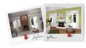
 Deciding to change your interior color scheme can seem ambitious, especially for those who are new to it. While no changes are absolutely permanent, it’s not necessarily cost effective to re-paint an entire interior or purchase new furnishings should you decide you’re unhappy with the final outcome. Fortunately, there are a few time tested, tried-and-true color combinations that always look great together.
 Decorating a nursery is such an exciting and tender interior design project. It is a chance for parents to channel their enthusiasm while waiting for the newest member of their family to arrive. That being said, the days of “pink or blue?” have faded into the past. Parents in the modern era are faced with a bevy of decisions: traditional or contemporary? Gendered or neutral? Theme or no theme?