 Deciding to change your interior color scheme can seem ambitious, especially for those who are new to it. While no changes are absolutely permanent, it’s not necessarily cost effective to re-paint an entire interior or purchase new furnishings should you decide you’re unhappy with the final outcome. Fortunately, there are a few time tested, tried-and-true color combinations that always look great together.
What’s the deal with color relationships anyway?
First, let’s talk a little bit more about colors and their relationships. Many moons ago, artists put together The Color Wheel, which helps to show color variations, as well as the relationships that exist between various colors. For example, complementary colors live directly opposite one another on the wheel. Analogous colors live in triads right next to one another. Both of these color relationships are considered harmonious.
Then, you have your neutral colors. These are colors like whites, creams, beiges, and browns. They can provide a backdrop that remains consistent while your accents, furnishings, and textiles comprise ever-evolving color schemes.
All of these terms, complementary, analogous, and neutral are thrown around willy-nilly in the world of interior design. But, at the end of the day, the important thing is that you are happy with the color combinations you select.
5 Examples of Tried-and-True Color Combinations
- Blue and White. This color combination explains why Blue Willow and Delftware are timeless china collections. It is clean, bright, and can work with any design motif – be it antique traditional or über-modern. Depending on the balance of blue and white, you can create a light, energetic seaside living space or a soothing bedroom retreat. Throw in a pop of bright yellow if you want to energize it a bit.
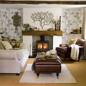
- Brown and Blue. Brown is a neutral color, and it is also one of the most common colors found in nature, which is why it pairs so well with blue. From bright blues to more earthy gray-hues, you really can’t go wrong. You can also swap your blue accents for green ones, without ever changing your brown backdrop should you want to refresh your look down the road.
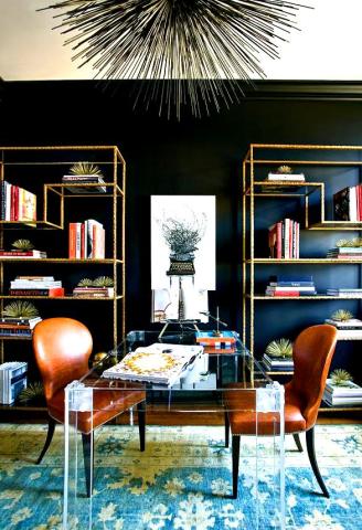
- Black and White. From black and white checkered flooring, to striped walls and floral motifs, black and white are a classic color combination. One of the most fun aspects of using black and white in an interior design is that they pair well with almost any other color, especially, primaries, and you can safely layer different black-and-white patterns without worrying about clashing.
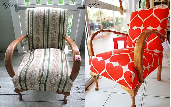
- Turquoise and Red. The first three examples are safe and lean toward the traditional. For the last two, we’ll feature color combinations with a little more pizzazz. Turquoise is an energized blue-green combo that will liven up any room. Pair it with red, and you have a striking combination. If turquoise walls seem too bold for your taste, then use light neutral wall colors and add your turquoise and red via furnishings, artwork, and accents.
- Green and Yellow. This combination is a citrus palate: greens, yellows, and oranges all work well together and you can add some blue too. Earthier versions of these colors, as seen in this retro-inspired backsplash can be provide a more muted aesthetic, or you can add a vibrant, warm energy to a space by using them in their full glory.
When in doubt, hire an interior design professional to help you select the color combinations that best reflect your style. What are some of your favorite color combos?